Improved outage map will help members understand more accurately
the outages affecting them so they can navigate life’s storms more effectively.
by
CASSIDY CAREY
United members can expect to see a change in United’s outage map in January 2024. United is replacing the old outage map with a new and improved version that features more precise information and includes new features to provide a better member experience.

“Members will have the same outage location information that they get with the current map, but now they will have the ability to view this information on a map that can include the current weather, more concise outage area boundaries, and additional outage summaries,” Wennermark said.
Small outages on the old map are depicted as a square for predicted outages and a circle for verified outages, while larger outage areas were also outlined with a polygon. The outage areas on the old map are assigned a specific color based on how many people are affected, and when a crew has been assigned to the outage a hardhat appears over the area.
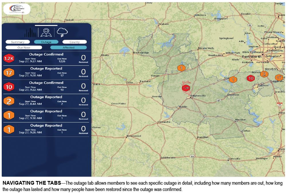
The new map will show a hexagon over the outage location and the exact number of affected members will be listed inside the hexagon. Larger outages will have a more precise shape outlining the impacted area.
“The new symbolism allows United to provide more specific and accurate information than before,” said Chad Pence, GIS supervisor.
An orange hexagon denotes an outage that has been reported to United, and a red hexagon signifies that the reported outage has been confirmed and is being repaired by United line crews.
“Listing the exact number of affected members, using simplified verbiage and two distinct colors for reported and confirmed outages, will make the outage map more user friendly for members.” Pence said.
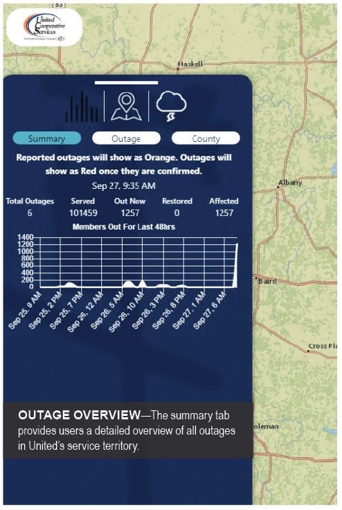
In addition to user-friendly symbolism, the new map gives members access to even more data with the new tab system that will include summary, outage and weather tabs.
“The membership’s experience will be improved with these new options on the map. The weather overlay will allow them to be more aware of why outages are occurring, they will be able to summarize all outages by county, and the highlighted outage areas on the map will be more concise, so they encompass only United’s distribution lines and service locations” said Bruce Goss, United’s system operations engineering manager.
The summary tab lets members get an overview of all reported outages and the total number of affected members all in one place. “Having this information is helpful for members who want to see the full effects of outages in their community and surrounding areas,” Goss said.
The outage tab will show each individual outage in detail, including the status, time started, number of restorations and number of members affected, Goss said. Showing individual outage details allows members to monitor outages that affect them with the most up to date information available.

If there is a large outage affecting a high number of members, this information will let members see how the outage is affecting their specific county as a whole.
“The weather tab is a feature that we are excited to introduce because members will have a live weather radar on the map that shows them the most up to date weather status in their area,” Pence said. “Adding a weather feature will keep members informed as to how weather may be impacting outages.”
The weather tab will also have a new feature that allows members to change the base map, he said. The base map can be changed to a topographic, satellite or contrast map to provide the most detailed information possible.
“We recommend that members go to United’s webpage to look at the new map when it is released to familiarize themselves with the new features so that they are prepared in the event of an outage,” Pence said. “When doing so, members will see a question mark in the top right corner that they can click on to be guided through the new features of the map. After clicking on the question mark, each feature will show an explanation of what it does and how it works when clicked on. We believe this will make adjusting to United’s updated map quick and easy.”
Keeping members informed is a top priority at United, which is why they are excited to do so by bringing members the latest software available.
“While the core functions and the location of the map on our website will not change, these new features will help United provide the exceptional service and value that we promise our members,” Wennermark said.


